Show your Data in a Google Map with Python
Create an interactive display for geographical data with python: real-estate prices near Geneva.
In this post, you will learn how to use python to overlay your data on top of a dynamic Google map.
As an example, we will use a dataset containing all the real-estate sells that occurred in 2018 and 2019 in France, near the swiss town of Geneva. If you just want to see the prices, you'll find a ready-to-use interactive plot at the end of the post.
In real world data science, geographical datasets are everywhere. In fact, as soon as measurements are done at a given place in the world, the dataset becomes geographical. Think about census, real estate, a distributed system of IOT sensors, geological or weather data, etc.
To gain insight into such datasets, you need to be able to display or segment them as a function of geographical coordinates. As soon as you do that, obvious features will jump at your eyes. You'll see and fix bugs in your data processing, and you'll start thinking about ways to extract valuable information from these datasets.
So here's the outline of this article:
- Installation: set up python for this exercise
- Get a Google Map API key : this is necessary to be able to display google maps in your applications
- How to prepare your data for geographical display : we will use pandas to read the dataset from file, and have a first look at the data before display.
- Dynamic Google Map with data overlay : we will create a nice interactive plot with bokeh.
Installation
In the article Interactive Visualization with Bokeh in a Jupyter Notebook, we have seen how to use bokeh to easily create interactive and engaging visualizations. And in Simple Text Mining with Pandas, you can see how pandas can be used to process and analyse data efficiently, in a few lines of code.
As mentioned above, we will need pandas for data analysis and bokeh for visualization. So we are now going to set up a new Anaconda environment with both tools.
First, Install Anaconda if not yet done, and create the new environment, and activate it:
conda create --name geovis python=3.7
conda activate geovis
Then, install the additional packages that we need:
conda install pandas bokeh jupyter
Get a Google Map API Key
The API key is necessary to be able to create a Google Map from an application or a website such as this one.
To get it, follow the instructions from Google.
Before getting started please note that the Google Map API is NOT free. But Google offers 200 dollars of free credit per month, which is more than enough to follow this tutorial, and even to use the API as a hobby. For example, this web page is not going to cost me anything, given the amount of traffic I'm currently getting.
After you get your key, put it in an environment variable (we will read this variable later on to draw the maps:)
export GOOGLE_API_KEY=<your_key>
Loading the Data with pandas
First, download the dataset csv file here, and save it as dvf_gex.csv.
We start by importing pandas and by setting up bokeh for integrated display within the jupyter notebook:
import pandas as pd
from bokeh.io import output_notebook
output_notebook()
bokeh_width, bokeh_height = 500,400
Then, we load our data into a pandas dataframe, and we print the first rows:
df = pd.read_csv('dvf_gex.csv')
df.head()
Each row in the data frame corresponds to a single transfer of real-estate ownership. And here is a description of the columns:
- price : price at which the property was sold
- area_tot : total floor surface, including buildings, garden, etc.
- area_build : surface of the buildings. If it's 0, it means that this property has no buildings yet.
- lon : longitude
- lat : latitude
The first column is the index of the df dataframe, and the second column is the former index of the dataframe from which I extracted this small sample. You can just forget about them.
We will start by simply displaying a dynamic Google Map, and we will gradually improve our plot by adding more and more features. Finally, we will orverlay our data.
Dynamic Google Map in the Jupyter notebook
First, we need to choose a coordinate for the center the map. I decided to use the one of Saint-Genis-Pouilly, France, which is in the middle of the area we're interested in. To find the coordinate of a place, you can type search Google for the name of this place, followed by the keywords "lat lon". Here is what I got:
lat, lon = 46.2437, 6.0251
We now have to read the Google Map API key from the environment variable (see above:)
import os
api_key = os.environ['GOOGLE_API_KEY']
Then, we import the bokeh tools needed to show a simple dynamic map, and we write a small function to show the map:
from bokeh.io import show
from bokeh.plotting import gmap
from bokeh.models import GMapOptions

def plot(lat, lng, zoom=10, map_type='roadmap'):
    gmap_options = GMapOptions(lat=lat, lng=lng,
                               map_type=map_type, zoom=zoom)
    p = gmap(api_key, gmap_options, title='Pays de Gex',
             width=bokeh_width, height=bokeh_height)
    show(p)
    return p
And we call this function:
p = plot(lat, lon)
You can now try and call again the function with different arguments. For example, you could use different coordinates for the center (maybe the ones of your place?), a different zoom level, or different map types (try satellite or terrain).
Now, let's add a marker showing the center of the map:
def plot(lat, lng, zoom=10, map_type='roadmap'):
    gmap_options = GMapOptions(lat=lat, lng=lng,
                               map_type=map_type, zoom=zoom)
    p = gmap(api_key, gmap_options, title='Pays de Gex',
             width=bokeh_width, height=bokeh_height)
    # beware, longitude is on the x axis ;-)
    center = p.circle([lng], [lat], size=10, alpha=0.5, color='red')
    show(p)
    return p

p = plot(lat, lon, map_type='terrain')
You can use the toolbar on the right side of the map to activate the pan, wheel zoom, and reset tools.
Google Map with Data Overlay in the Jupyter Notebook
That's actually not much more difficult than what we've already done!
We just need to declare a bokeh ColumnDataSource for the data we want to overlay, from our dataframe.
Once this is done, we just need to tell bokeh which columns to use for the x and y coordinates.
But before we do this, we first need to check how many points we're going to display. Indeed, you should keep in mind that bokeh will send these points to the client browser. If you send too many, you're just going to kill it. Let's see:
df.shape
Only 3000 points or so, that's perfect. As a rule of thumb, you can display up to 50 000 points. If you have more, you will need to resort to other strategies, and we will see how to do that in a future post.
from bokeh.models import ColumnDataSource

def plot(lat, lng, zoom=10, map_type='roadmap'):
    gmap_options = GMapOptions(lat=lat, lng=lng,
                               map_type=map_type, zoom=zoom)
    p = gmap(api_key, gmap_options, title='Pays de Gex',
             width=bokeh_width, height=bokeh_height)
    # definition of the column data source:
    source = ColumnDataSource(df)
    # see how we specify the x and y columns as strings,
    # and how to declare as a source the ColumnDataSource:
    center = p.circle('lon', 'lat', size=4, alpha=0.2,
                      color='yellow', source=source)
    show(p)
    return p

p = plot(lat, lon, map_type='satellite')
Nice! We're now ready to make this plot actually useful.
The first thing we're going to do is to add a bit of interactivity: wouldn't it be nice to get information about a point by just hovering over the point with the mouse?
Then, we can encode information in the point display style. For now, we show all points in yellow, and with the same size. But we could use size and color to display the property price and surface, for example.
Bokeh HoverTool and ToolTips
We can choose and configure the tools that appear on the top right side of the plot. By default, we get the pan, wheel zoom, and reset tools. Let's add the hover tool:
def plot(lat, lng, zoom=10, map_type='roadmap'):
    gmap_options = GMapOptions(lat=lat, lng=lng,
                               map_type=map_type, zoom=zoom)
    # the tools are defined below:
    p = gmap(api_key, gmap_options, title='Pays de Gex',
             width=bokeh_width, height=bokeh_height,
             tools=['hover', 'reset', 'wheel_zoom', 'pan'])
    source = ColumnDataSource(df)
    center = p.circle('lon', 'lat', size=4, alpha=0.5,
                      color='yellow', source=source)
    show(p)
    return p

p = plot(lat, lon, map_type='satellite', zoom=12)
You can now move your mouse to a point, and a tooltip will appear. But the information from the tooltip is still very limited. Let's improve this. For that, we stop using the default hover tool, and we define our own.
from bokeh.models import HoverTool

def plot(lat, lng, zoom=10, map_type='roadmap'):
    gmap_options = GMapOptions(lat=lat, lng=lng,
                               map_type=map_type, zoom=zoom)
    # the tools are defined below:
    hover = HoverTool(
        tooltips = [
            # @price refers to the price column
            # in the ColumnDataSource.
            ('price', '@price euros'),
            ('building', '@area_build m2'),
            ('terrain', '@area_tot m2'),
        ]
    )
    # below we replaced 'hover' (the default hover tool),
    # by our custom hover tool
    p = gmap(api_key, gmap_options, title='Pays de Gex',
             width=bokeh_width, height=bokeh_height,
             tools=[hover, 'reset', 'wheel_zoom', 'pan'])
    source = ColumnDataSource(df)
    center = p.circle('lon', 'lat', size=4, alpha=0.5,
                      color='yellow', source=source)
    show(p)
    return p

p = plot(lat, lon, map_type='satellite', zoom=12)
And you can now interactively inspect any point with the hover tool.
Variable marker size in bokeh
Marker size and marker color is a great way to immediately convey information about the dataset. We can decide to affect any information to these visual attributes.
For example, I'd like to find out what are the most expensive properties, and the ones that went away at a price that is way too high.
So I will relate the marker size to the price, and the color to the price per square meter.
Let's start with the price.
First, we define a radius column in our dataframe, related to the price:
import numpy as np
df['radius'] = np.sqrt(df['price'])/200.
df.head()
Two things to note:
- I made the radius proportional to the square root of the price, so that the surface of each circle is proportional to the price (since the surface is equal to $\pi R^2$). We could have made a different choice.
- I divided by 200 to get a radius that is in the right ball park (see below).
def plot(lat, lng, zoom=10, map_type='roadmap'):
    gmap_options = GMapOptions(lat=lat, lng=lng,
                               map_type=map_type, zoom=zoom)
    hover = HoverTool(
        tooltips = [
            ('price', '@price euros'),
            ('building', '@area_build m2'),
            ('terrain', '@area_tot m2'),
        ]
    )
    p = gmap(api_key, gmap_options, title='Pays de Gex',
             width=bokeh_width, height=bokeh_height,
             tools=[hover, 'reset', 'wheel_zoom', 'pan'])
    source = ColumnDataSource(df)
    # we use the radius column for the circle size:
    center = p.circle('lon', 'lat', size='radius',
                      alpha=0.5, color='yellow', source=source)
    show(p)
    return p

p = plot(lat, lon, map_type='satellite', zoom=11)
Now try to zoom in and out a bit. You'll see that the size of the circles does not change. So the circles will start to overlap if you zoom out too much. To cure this, we just need to make a very small change. Instead of setting the size of the circles, we will set their radius, which is expressed in the units of x and y (longitude and latitude).
# I need to change the radius coefficient
# so that the points are visible
df['radius'] = np.sqrt(df['price'])/5.

def plot(lat, lng, zoom=10, map_type='roadmap'):
    gmap_options = GMapOptions(lat=lat, lng=lng,
                               map_type=map_type, zoom=zoom)
    hover = HoverTool(
        tooltips = [
            ('price', '@price euros'),
            ('building', '@area_build m2'),
            ('terrain', '@area_tot m2'),
        ]
    )
    p = gmap(api_key, gmap_options, title='Pays de Gex',
             width=bokeh_width, height=bokeh_height,
             tools=[hover, 'reset', 'wheel_zoom', 'pan'])
    source = ColumnDataSource(df)
    # see how we set radius instead of size:
    center = p.circle('lon', 'lat', radius='radius', alpha=0.5,
                      color='yellow', source=source)
    show(p)
    return p

p = plot(lat, lon, map_type='satellite', zoom=11)
This is looking good, and you can already see that some of the properties were sold for an awful lot of money. Especially in the vicinity of the airport, at the frontier between France and Switzerland. These big sell-outs actually correspond to buildings or terrains that are going to be used for commercial purposes, maybe a parking or a supermarket.
Marker color map in bokeh
Now, we want to use the marker color to display information about our dataset. I'd like to show the price per square meter for buildings.
Obviously, there is no way to compute this quantity if the surface of the building is zero. So we're first going to create a new dataframe, dropping all rows for which the building surface is zero. Then, we compute the price per square meter:
dfb = df[df['area_build']>0.].copy()
dfb['pricem2'] = dfb['price']/dfb['area_build']
dfb.head()
Then, we change our plotting function to display a marker color related to the price per square meter:
from bokeh.transform import linear_cmap
from bokeh.palettes import Plasma256 as palette
from bokeh.models import ColorBar
# we are adding the dataframe as a parameter,
# since we are now going to plot
# a different dataframe
def plot(df, lat, lng, zoom=10, map_type='roadmap'):
gmap_options = GMapOptions(lat=lat, lng=lng,
map_type=map_type, zoom=zoom)
hover = HoverTool(
tooltips = [
('price', '@price euros'),
# the {0.} means that we don't want decimals
# for 1 decimal, write {0.0}
('price/m2', '@pricem2{0.}'),
('building', '@area_build m2'),
('terrain', '@area_tot m2'),
]
)
p = gmap(api_key, gmap_options, title='Pays de Gex',
width=bokeh_width, height=bokeh_height,
tools=[hover, 'reset', 'wheel_zoom', 'pan'])
source = ColumnDataSource(df)
# defining a color mapper, that will map values of pricem2
# between 2000 and 8000 on the color palette
mapper = linear_cmap('pricem2', palette, 2000., 8000.)
# we use the mapper for the color of the circles
center = p.circle('lon', 'lat', radius='radius', alpha=0.6,
color=mapper, source=source)
# and we add a color scale to see which values the colors
# correspond to
color_bar = ColorBar(color_mapper=mapper['transform'],
location=(0,0))
p.add_layout(color_bar, 'right')
show(p)
return p
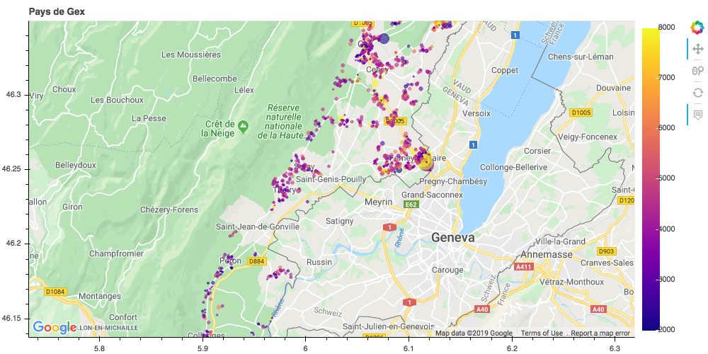
p = plot(dfb, lat, lon, map_type='roadmap', zoom=11)
Now you can immediately find the properties that were sold way above the market price. For example, in Bretigny, we find a house with 80 m2 sold for 705 000 euros, while nearby, there is another house with 142 m2 sold for 695 000 euros.
But wait! the first one has 9150 m2 of garden! So that's certainly a pretty good deal. I wouldn't be surprised to see that garden separated in 10 parts that are going to be sold very soon.
Conclusion
In this article, you have learnt how to:
- create a dynamic Google Map in a jupyter notebook
- overlay your data on this map
You're now ready for exciting geographical data analysis!
In future posts, we will see how to:
- integrate these maps into web pages, as I'm doing here.
- plot big data (remember that the techniques shown above will kill your client's browser if you show more than 50 000 points or so)
- create choropleth maps, that allow you to show data according to predefined geographic boundaries (e.g. population per country)
Please let me know what you think in the comments! I’ll try and answer all questions.
And if you liked this article, you can subscribe to my mailing list to be notified of new posts (no more than one mail per week I promise.)
Learn about Data Science and Machine Learning!
You can join my mailing list for new posts and exclusive content: