Articles visualization

Visualizing Datasets
Study variable correlations with matplotlib and seaborn, and use dimensionality reduction (PCA, t-SNE) to display complex datasets.
Read More →
COVID-19 Analysis
Analyse the COVID-19 data from John Hopkins University by yourself with python (pandas, holoviews, matplotlib)
Read More →
Matplotlib for Machine Learning
Learn the basics of matplotlib in 1h. You'll make your first plots with a toy machine learning example.
Read More →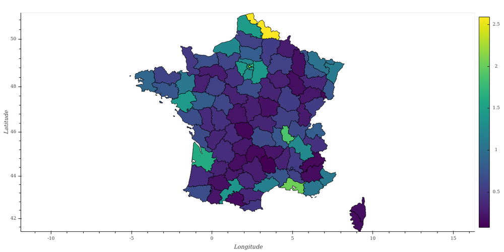
Choropleth Maps in Python (2021)
Create a choropleth map with geoviews and geopandas. Working geoviews installation instructions as of May 2021.
Read More →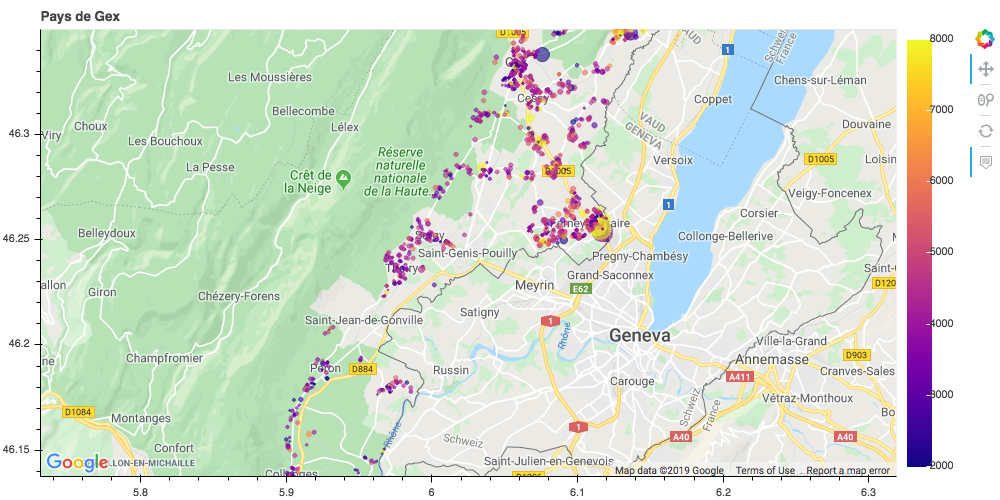
Show your Data in a Google Map with Python
Create an interactive display for geographical data with python: real-estate prices near Geneva.
Read More →
Data pipeline with Docker, InfluxDB, and Grafana
Set up a typical data pipeline as may be used in experimental science and IOT, with Docker, InfluxDB, and Grafana.
Read More →
Interactive Visualization with Bokeh
Visualization is absolutely essential in data analysis, as it allows you to directly feed your data into a powerful neural network for unsupervised learning: your brain. Learn how to use bokeh to dig deeper in your data!
Read More →